 Product Documentation
Product Documentation
Product Documentation
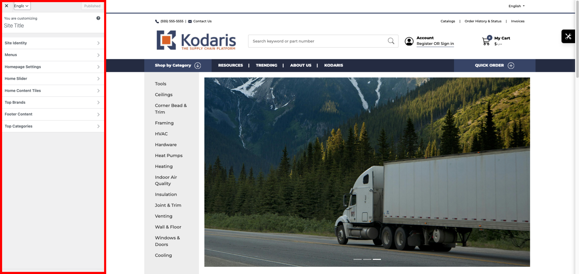
The Kodaris CMS provides users with a Customizer similar to what you would find in WordPress. This Customizer allows you to manage and customize aspects of your website, like the header and footer menus, widgets, sliders, social media links, and more.
To locate the Customizer, log into your Kodaris Operations portal, click CMS, and select Menus. This will bring you to your website with the Customizer on the left-hand side.
The Menus section is used for customizing the navigation menus on your website, such as the header and footer. You can edit existing menus and create new menus here.
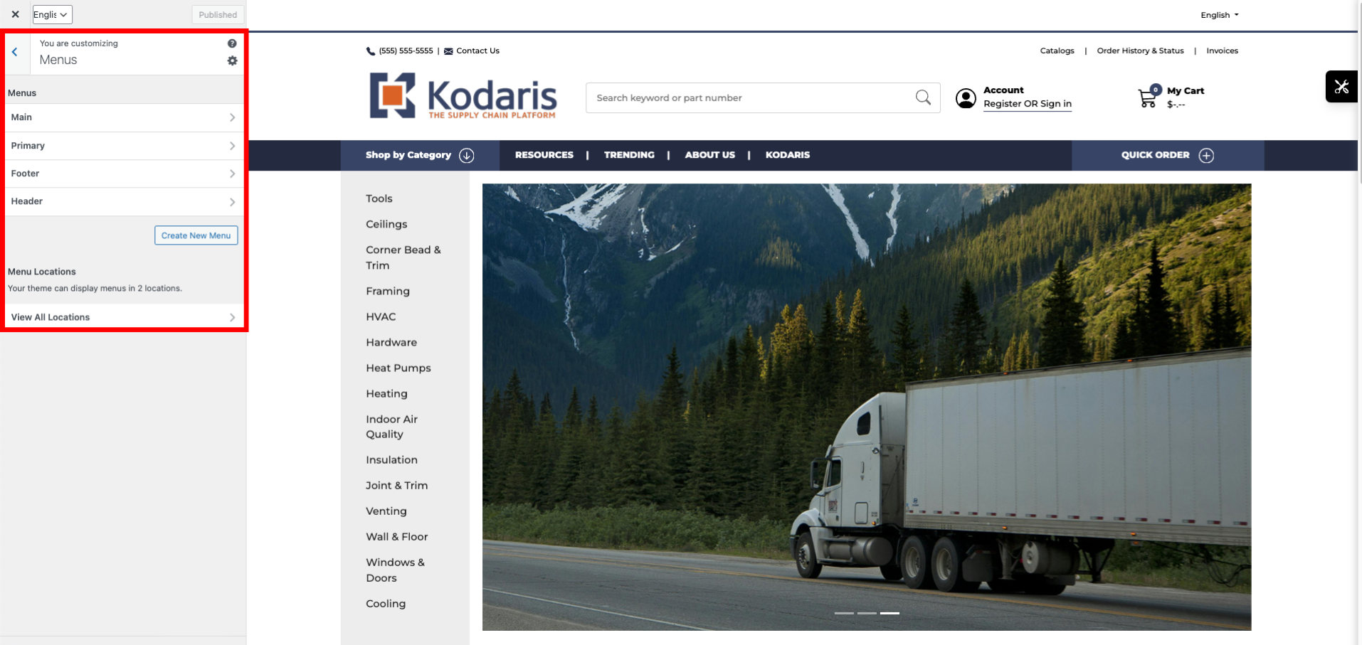
For example, within the Footer menu, you can manage the menu items by clicking on them. Under each item, you can edit the item’s text and URL. You can also arrange the order of the footer menu by dragging and dropping each menu item.

You can manage your homepage’s slider using the Home Slider section. Here, you can upload a compatible image and assign the image a hyperlink.

Manage the content tiles of your homepage under the Home Content Tiles section. Per each content tile, you can include an image, URL, title, and additional explanatory text. You can create as many tiles as you’d like.

Under Top Brands, you can add a section to your homepage that calls out your best-selling brands. This is similar to a “Featured Products” or “Recommended Products” section, but it will specifically call out various product brands you offer.

In the Footer Content section, you can manage aspects of your website’s footer, separate from those located under the Menu section. Here, you can add links to your company’s social media accounts and the logo you want included in the footer.

The Top Categories section is where you can manage another slider on your homepage. In this example, the title is also called “Top Categories”, but you can name the slider title to reflect what is best for your company. In this section, you can manage the title of the slider and create tiles with assigned images, titles, and links.

Within the Customizer, you can preview your website in not only desktop view but also mobile and tablet view. This feature allows you to be aware of your website’s user experience from all viewpoints.
