 Product Documentation
Product Documentation
Product Documentation
The Buttons block allows you to create button-style links that call attention to the most important action you want your visitors to take.


Every block comes with unique toolbar icons and blocks-specific user controls that allow you to manipulate the block right in the editor. The Buttons block has a toolbar for the individual button and a toolbar for the entire block.

The main toolbar for the entire block has the following icons:
Transforming to a Column block will let you display content in multiple columns, with blocks added to each columns. Transforming to a Group block will combine blocks into a group.


Use the Change alignment tool to align the Buttons block. Choose one of the following options:
The Options button on a block toolbar gives you more features to customize the block.

The individual Button block toolbar is where you can customize the text, link, and style for this button.

If you select a specific button, a new toolbar will appear with these additional options from the block toolbar:

Use this option to change the style of a particular button; you can select from Fill or Outline.
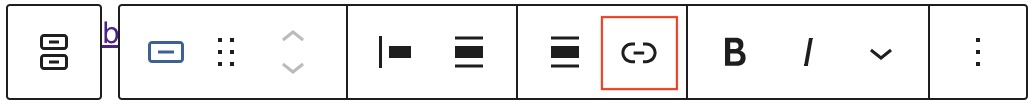
Use the Link option to add a link to the button. It’s also possible to set the link to open in a new tab.
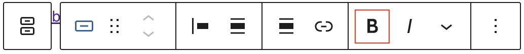
You can select the text in the Buttons block and use the Bold option or "Ctrl+B" / "Cmd+B" on your keyboard to bold it, which is usually heavier than the surrounding text.

You can select the text in the Buttons block and use the Italic option or "Ctrl+I" / "Cmd+I" on your keyboard to italicize it, which usually appears slanted to the right.

The drop-down menu to the right of the Bold and Italic options contains a range of additional rich text editing options such as highlighting, inline code, strikethrough, and more.

The Options button on a block toolbar gives you more features to customize a specific button.
The block settings panel contains customization options specific to the block.

When the entire Buttons block is selected, you have the Layout, Dimensions, and Advanced settings for customization.

Within the Layout section, you can change two aspects of the buttons:
You can also allow the buttons to wrap to multiple lines if desired by moving the slider to the right to turn the feature on.

In the Dimensions section, you can adjust the Margin and set Block spacing.
When a specific button from the Buttons block is selected, you have the Styles, Width, Color, Typography, and Dimensions customization settings.

Use this Styles option to change the individual button style to either Fill or Outline. You can hover over a particular style to see how it looks.

The Buttons block provides Color settings options to change the text color and background color, in either a solid or gradient scheme. This change will be applied to the entire button.

Use this Border setting to change the radius or the sharpness of the corners on the button; you can either drag the slider to increase the radius for all four sides equally, or you can click on the link button to be able to customize the radius for each corner.

In this section, you can control the the width of the button within the space. Each button can have its own Width setting inside the Buttons block based on a % value.

The Buttons block provides Typography settings to change the font size; you can either select from the options provided, or click the two horizontal lines icon to be able to enter a specific pixel size.

The Dimensions settings allows you to change padding around the button; you can either opt to have the same padding on all size of the button, or you can click on the link button to be able to enter specific padding values for the top and for the bottom.